
Branding and Digital Marketing
for Engineering: Timetooth [Noida]
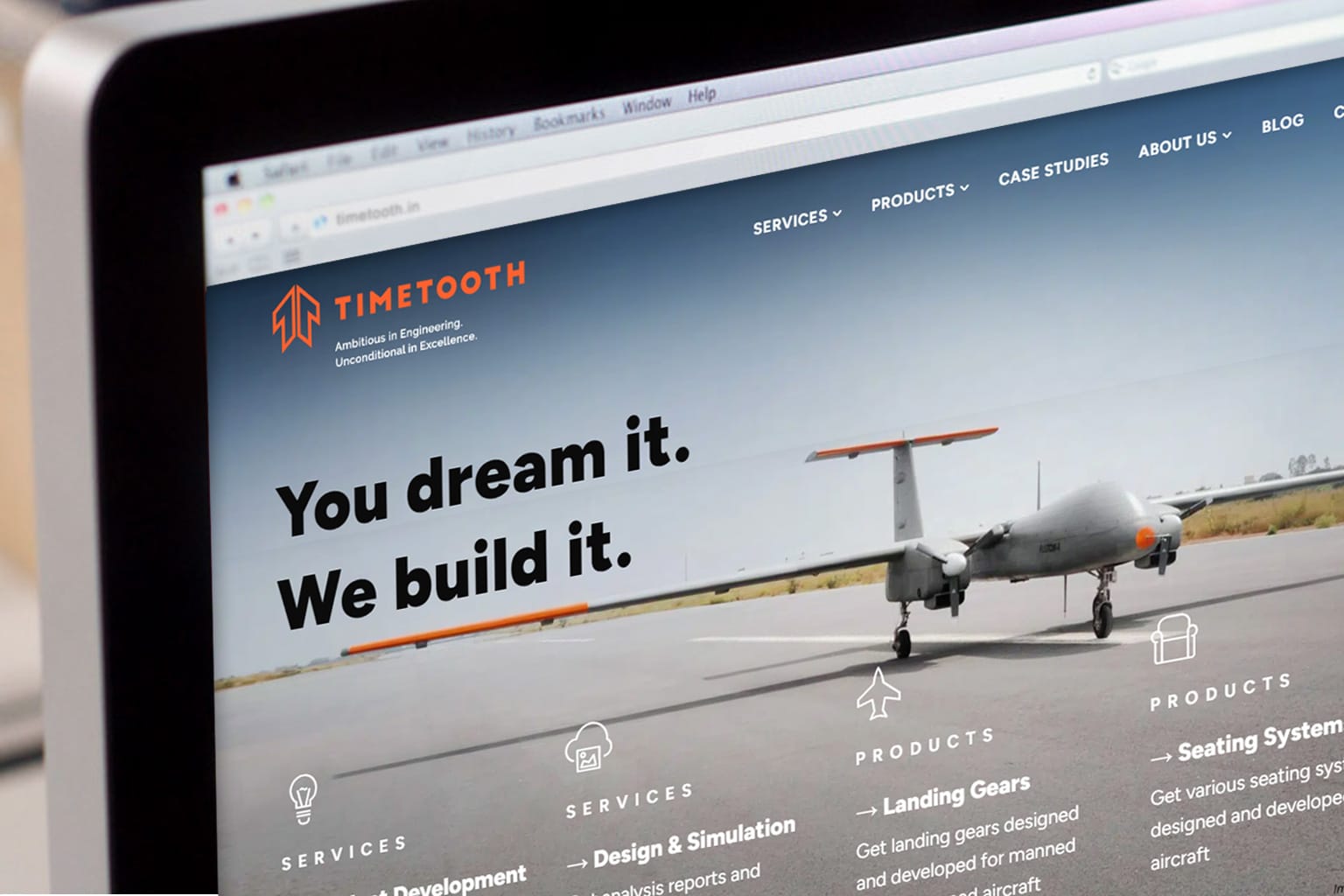
- Client Timetooth Technologies / Industry Engineering and Design / Category Brand Design
Background
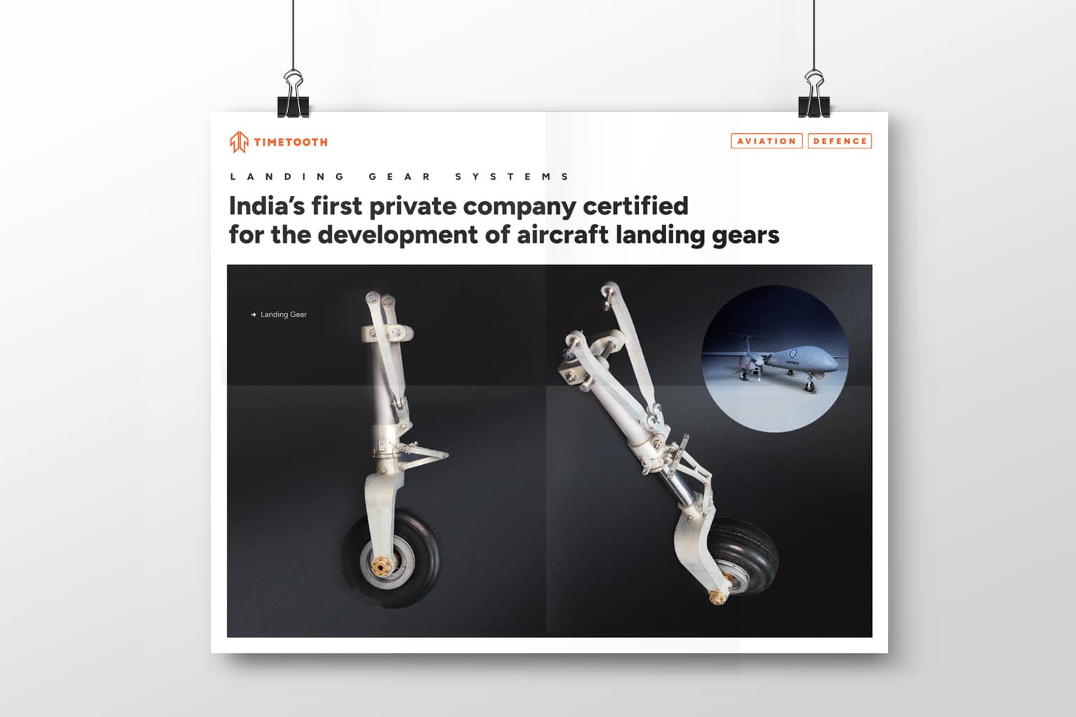
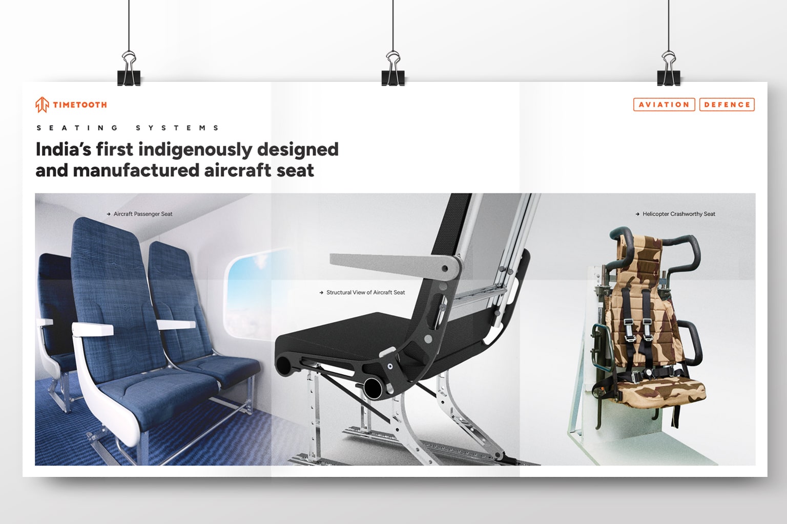
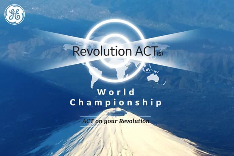
Timetooth is a leading engineering solutions firm in India providing high-performance engineering solutions to businesses and has pioneered mission-critical, made-in-India products for the Indian Aerospace and Defence Industry. A first at making many new beginnings within the engineering space in India, they are committed to establishing that Indian companies can develop world-class engineered products.
Timetooth sought our help to articulate their brand ideals and redefine their brand essence. We redesigned their visual identity to reflect their true brand personality and coined a distinct corporate tagline for them. Our research and in-depth analysis helped project their internal reality and capabilities to the world as “Engineers at heart and Engineers by profession”
Aligning with the brand's essence:
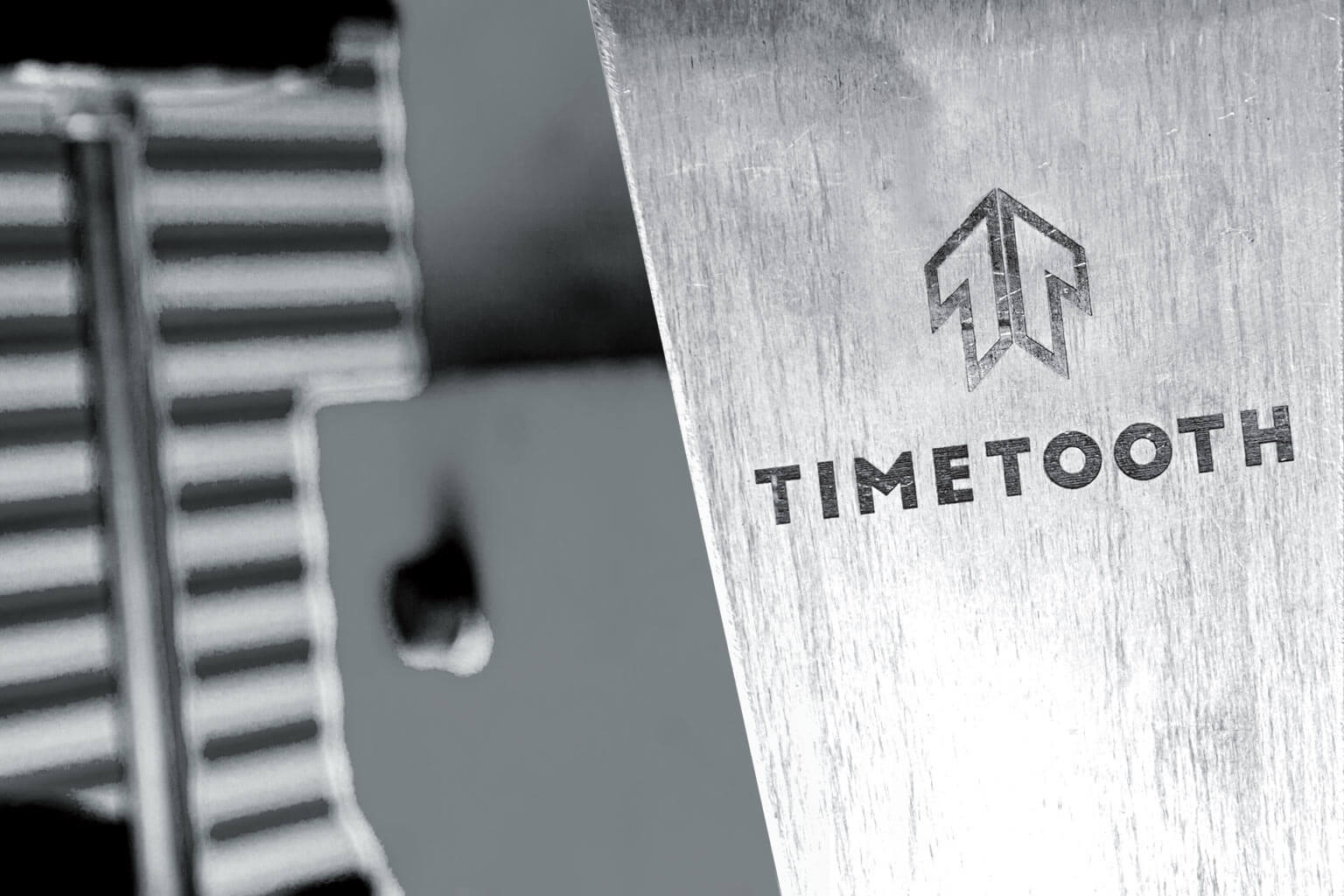
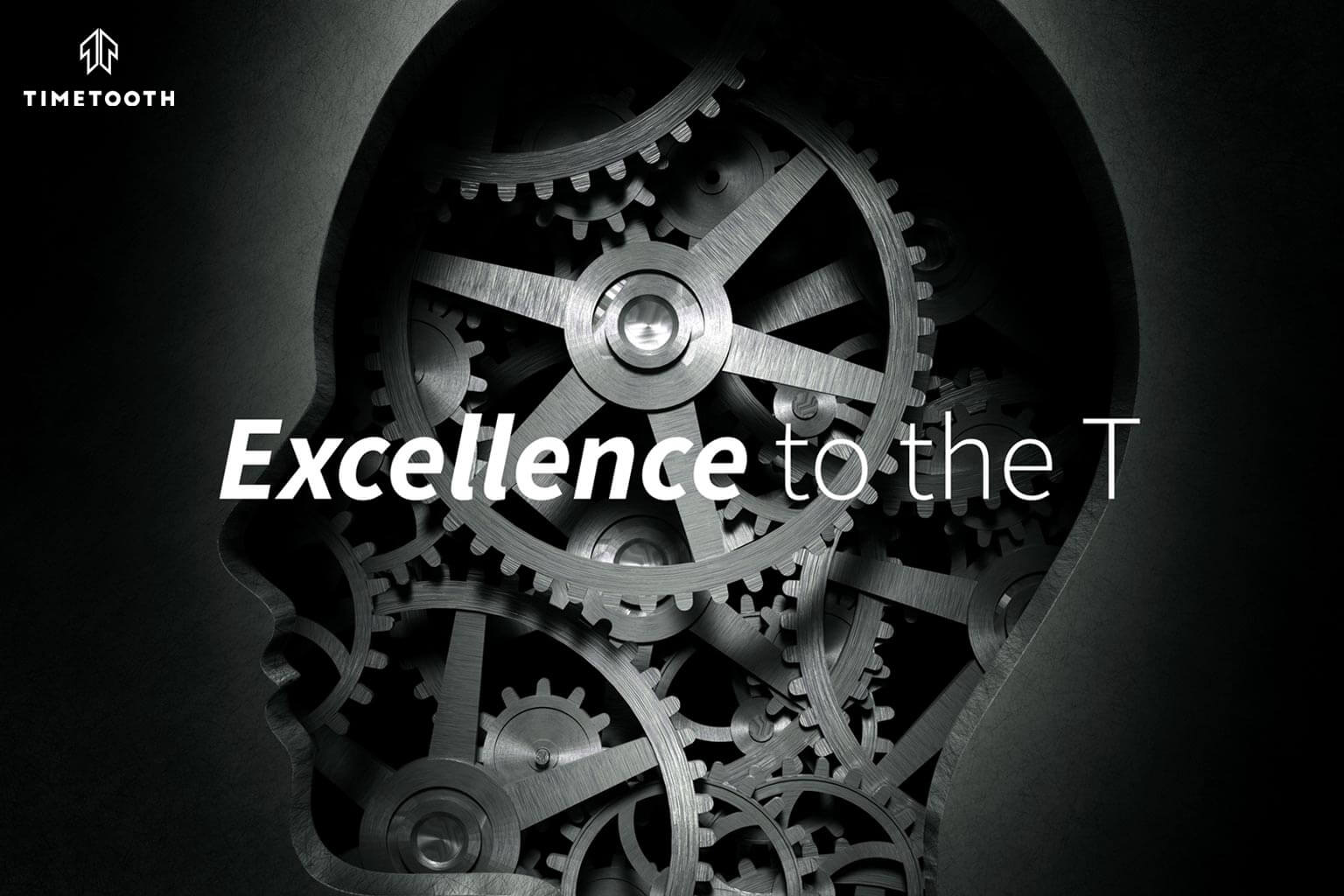
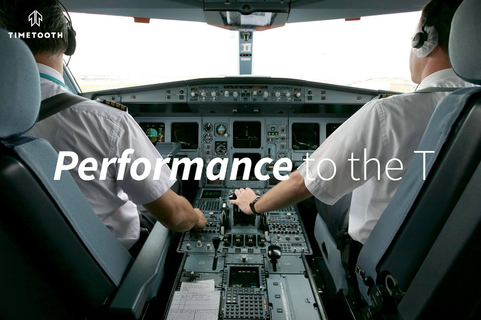
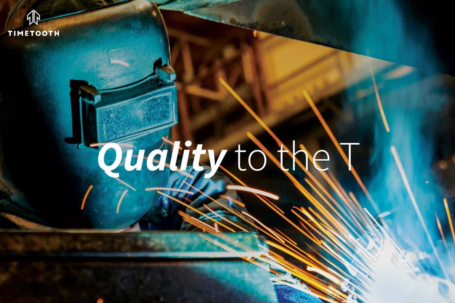
Engineering to the T
The focal point of creating a distinctive symbol for Timetooth was the letter T. The phrase, ‘to the T’, is generally used to connote something that is perfect, complete, or exact. We wanted the T, both as a symbol and icon, to be a reminder of that high performance, excellence, and perfection that Timetooth valued and stood for – Engineering to the T.
This approach would increase the recall value and memorability of the Timetooth brandname; besides, serving as an instant visual identifier when used, in isolation, as a product mark.
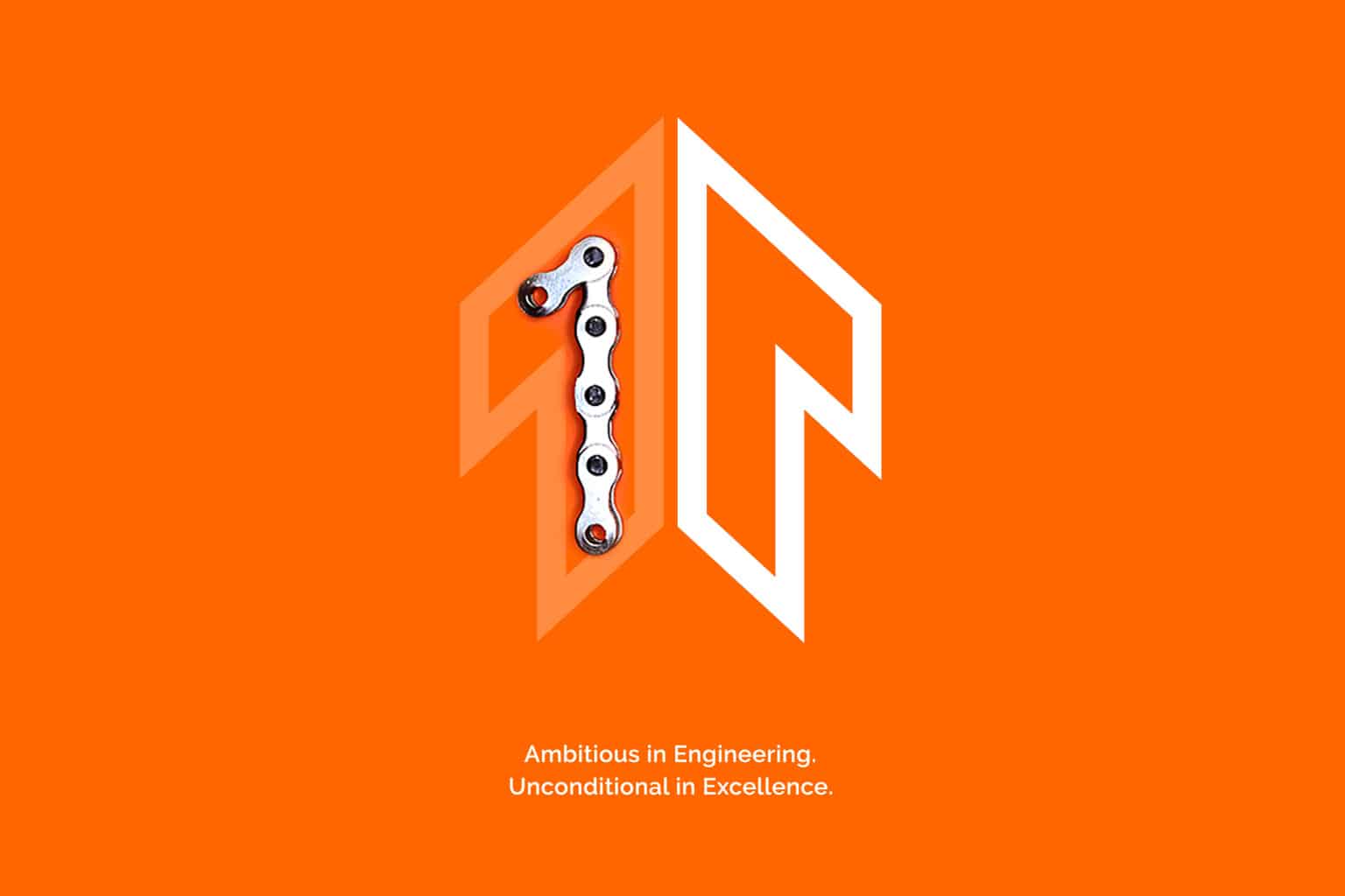
Creating the Visual Identity
The visual identity needed to communicate an overall sense of excellence, ambition, performance, and growth – Timetooth’s brand essence. To accomplish this we created the symbol of an upward-moving arrow by reflecting the numeric ‘1’ into the letter T. The numeric 1 was symbolic of the many firsts the company had to its credit.
The symbol was created to appear visually synchronous; two-dimensional at one instance, three-dimensional at another. A compounding of the number 1 and the letter T; together, becoming reminiscent of an aerial moving rocket-like object, suggestive of the aeronautics industry space in which Timetooth had established a niche in. Its planar appearance created a sense of separate smaller arrows converging into a peak (suggesting the ‘tooth of time’ mountain – the inspiration behind the company’s name).


Crafting Brand Messaging
The corporate tagline was crafted to align with Timetooth’s core attributes. The brand’s external messaging was designed to focus on its many firsts and accomplishments with an over-arching emphasis on its commitment to excellence, performance, and growth. The messaging strategy was created to be a significant brand differentiator.